Problem Statement
The User is a digital creative who needs a consistent automated professional workflow and finance management system because running a successful business involves many moving parts and depends on healthy financial management.
Project Vision
Work Management For Digital Creatives
Halftone is an app and website designed to help professional digital creatives' workflow. It focuses on tracking all pertinent documentation involving a client project to make the business side of a digital creative’s work easier. It is designed to automate portions of the business process to make it easier for digital creatives to focus on the actual products they are producing for their clients. This includes automated reminders of project tasks, messages to the client to encourage feedback when the product is updated, and automatically filled-in invoices based on project plans that can be edited and sent over to the clients. Other features would include template designs for standard project documents like project proposals or project contracts and the management of all overall clients, revenue, expenses, and equipment in both a web and application setting.
Project Objectives
Project Deliverables to Measure Success
An app that has a low learning curve
An app that can manage the invoicing process for digital creatives
An app that can encompass all of a digital creative’s process
A flexible design that can be modified to the user’s preference.
A solution to make a digital creative’s work and business management more manageable and more fluid
Findings Summary
Pre-Design Research
4 out of 5 users wanted an easy way to manage their workflow in one place
3 out of 5 users find managing the business side of their business sometimes overwhelming.
3 out of 5 users think they need a new system to organize their business.
One user expressed they wanted to find a way to have less uncomfortable conversations about money with their clients.
Usability Study 1
4 out of 5 users navigated to the projects page to add a project. An insight is that there needs to be an “add project” button on the projects page.
3 out of 5 participants expressed they thought the add menu could be helpful as a quick add for many app tasks. An insight is that identifying and adding main app tasks to the add menu would improve navigation.
5 out of 5 participants found the Navigation bar and dashboard tasks to be confusing or somewhat confusing. An insight is the app organization needs to focus on leveling tasks and having tasks of the same level look the same.
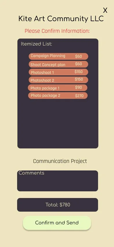
3 out of 5 participants felt the invoicing process required more confirmation and verification feedback from the app. An insight is that confirmation and verification pages need to be added, especially for tasks that send things to the client.
Usability Study 2
5 out of 5 participants found adding a project process easy. Two participants did this by navigating from the client on the home page, two by using the add button in the navigation bar, and one went to the projects page and added from there.
4 out of 5 participants had difficulty finding the timeline on the first try. All participants expressed that if there were a word, arrow, or other button indicator for the timeline, it would be easier to find.
3 out of 5 participants first went to the calendar and the dashboard for the project timeline.
5 out of 5 participants found the invoicing process to be easy.
User Profiles
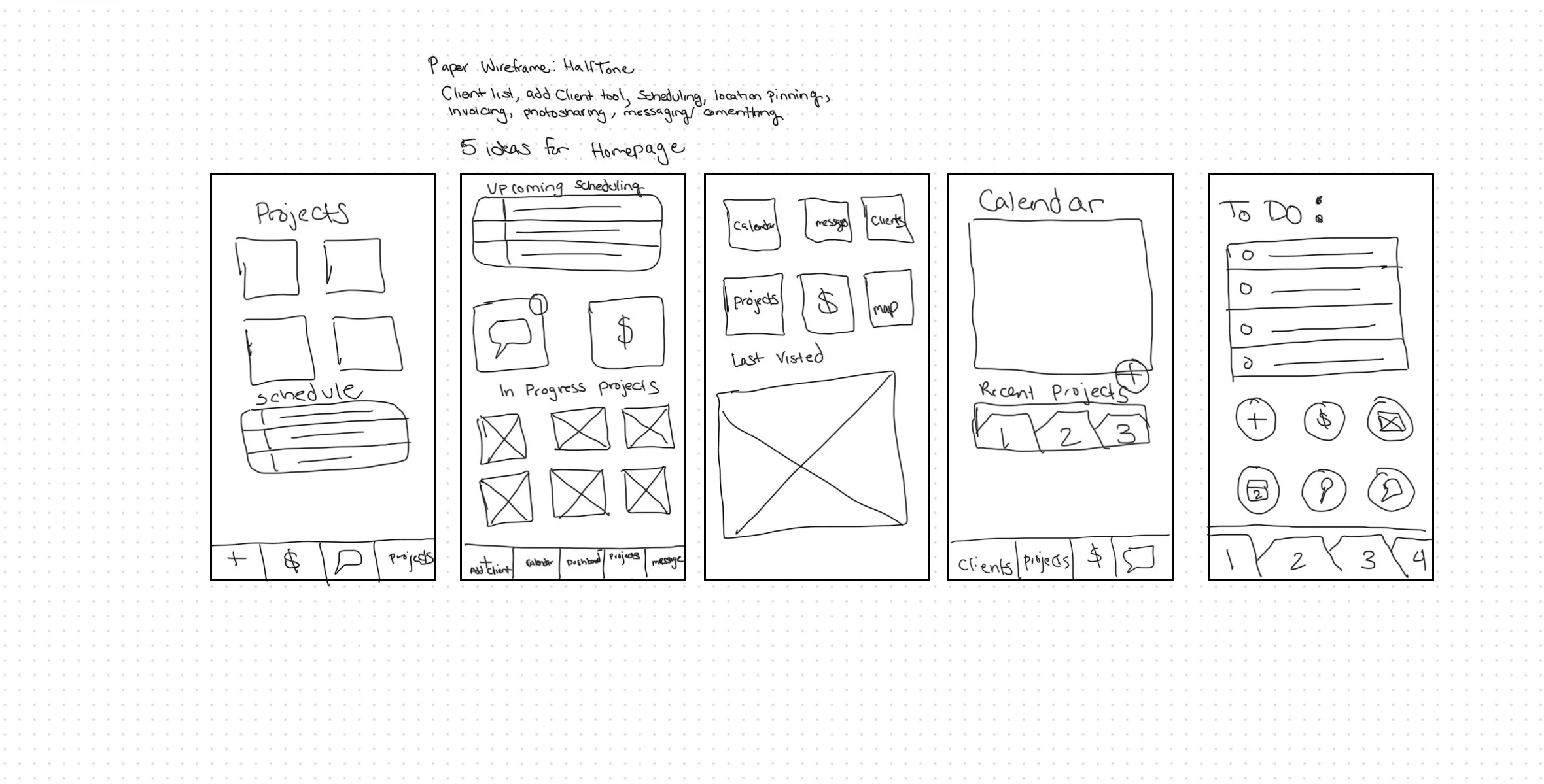
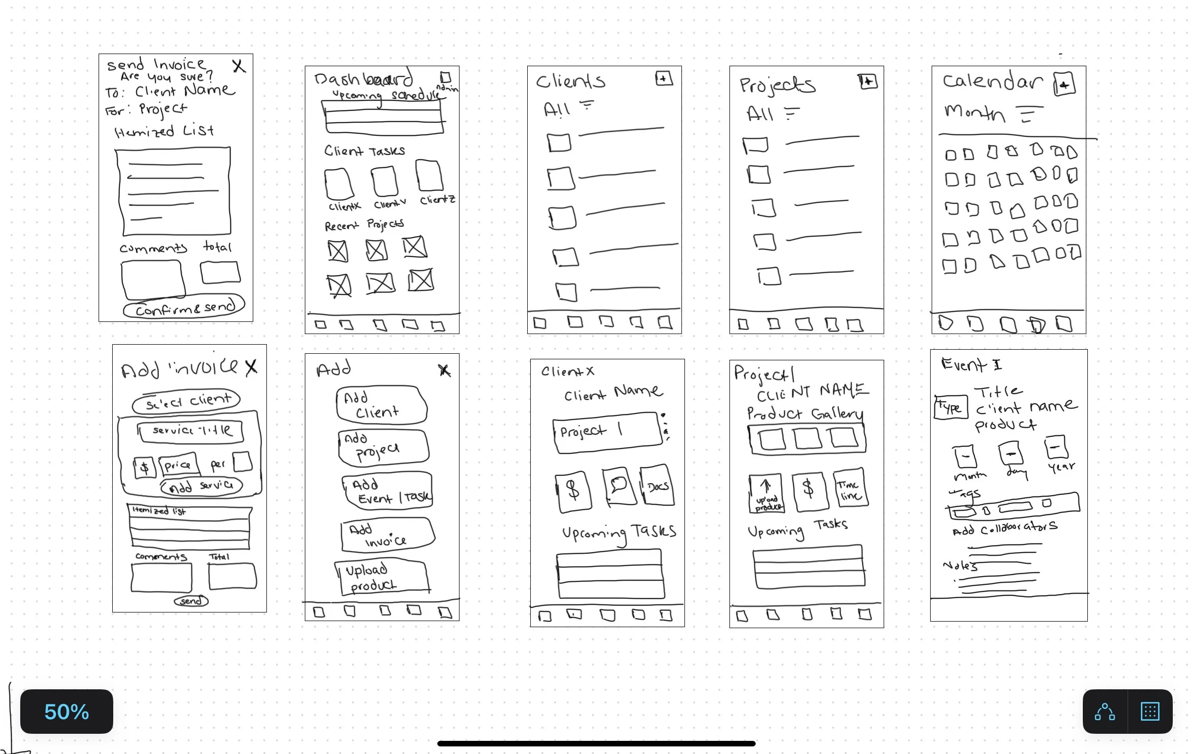
3. Wireframe three had all the main navigation on the main part of the home page, client page, messages, calendar, client, projects, invoicing, and maps. Additionally, there is a reference to the last viewed page.
4. The fourth option focused on a calendar view, and table for recent projects with upcoming to dos.
Wireframes
After gathering the initial research materials from users about their creative design process, I started with a speed round of wireframe ideas for the home page. One through Five are referred to in order from left to right.
The first idea is focused on having the most recently modified projects on the home page. Additionally, it would list upcoming events, with a navigation bar focusing on the add, invoicing, messaging, and projects pages.
5. The fifth option had a to do list format, with all app tasks and pages on the home page, and a tab system for most relevant projects.
2. Wireframe two first listed upcoming events/tasks, the had two main features, messaging and invoicing on the home page. Additionally, you could access recent projects, and the navigation bar had an add client button, calendar page, dashboard (this homepage) Projects, and messages page.
After evaluating the data from the first research survey, I decided to go with a variation of the second homepage concept. The only change was adding an admin button to the main task dashboard in the middle of the page.
Some features that are incorporated into this design include:
There is an added focus on making it easy to access what the user was working on.
A focus on making the invoicing tool easy to find and use.
A prioritization of managing client projects by the populating schedule on the dashboard and the calendar is the first navigation page after the add button.
Research Methodology Summary.
There were two formal rounds of Usability Studies. In the first round, 5 participants completed three tasks. These were monitored in in-person sessions. These sessions were recorded using voice notes and transcribed. Participants spoke aloud and completed both an oral interview and a written survey to evaluate the design's success, focused on navigation intuitiveness and organization. The first test was done on a low-fidelity prototype.
The second round of usability testing also had 5 participants who completed six tasks. These sessions were also recorded using voice notes and later were transcribed. These were monitored in in-person sessions. Participants spoke aloud and completed both an oral interview and a written survey, and testing was completed on a high-fidelity prototype. This test evaluated whether navigation intuitiveness improved and whether the app's aesthetics were pleasant and functional. The app's overall usability was evaluated using the industry standard System Usability Scale.
Version 1
Version 1 was a low-fidelity prototype prioritizing the initial prompt, “creating an invoicing app for photographers.”
User Flow
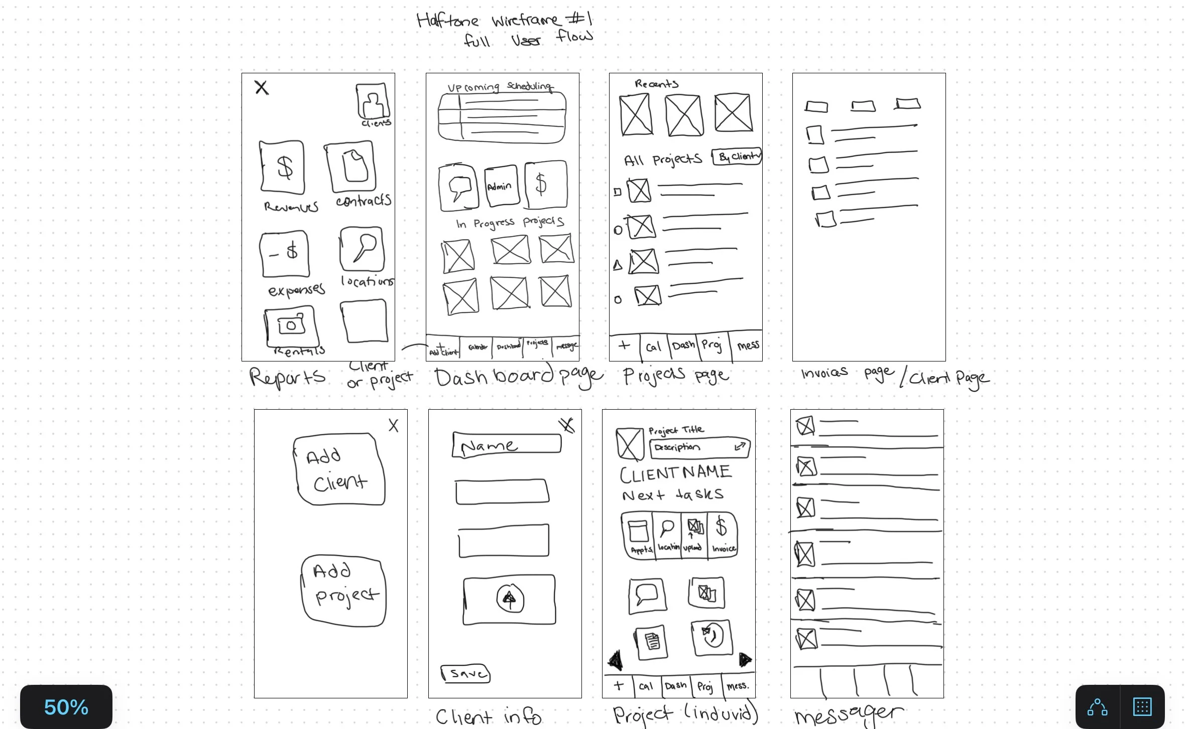
The Main features of the version 1 design’s user flow are:
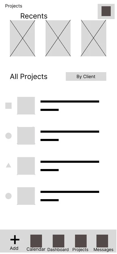
The navigation bar links to the calendar page, dashboard page, project page, and messages page
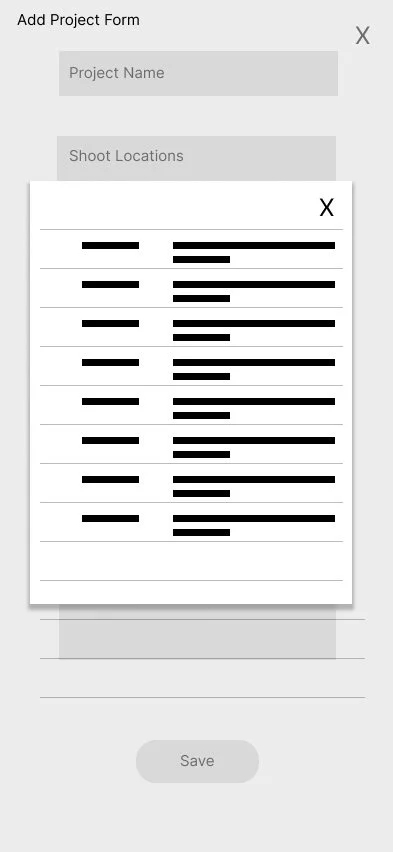
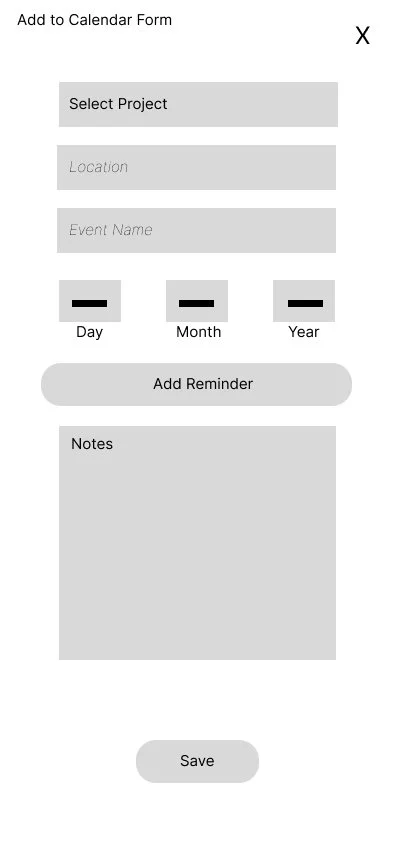
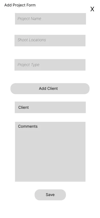
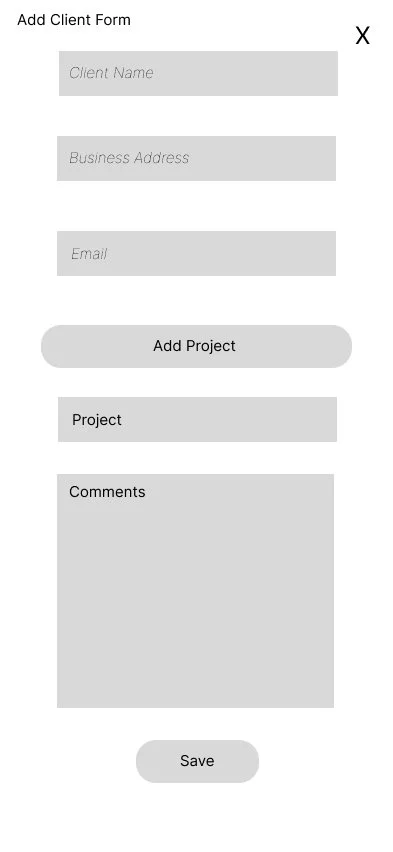
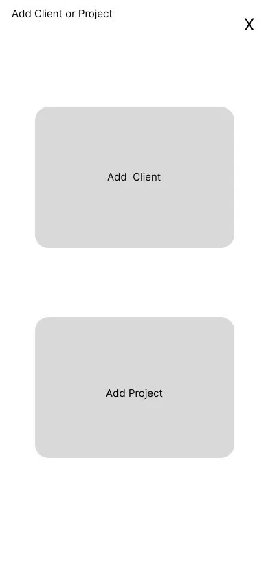
The add button allows two actions—Add Client and Add Project
The calendar has the month view only and an add-to calendar button,
The focus of this version was on the invoicing process, and the additional functions included Add Client, Add Project
View the app setup for version 1 in the image below.
Design
Some Questions Participants were Asked.
“How would you rate the ease of overall task completion?”
“If you were to change or add something what would you change?”
“What did you think about that process? Did you find anything confusing?”
“How would you evaluate this process compared to something similar you’ve used before?”
Research Data Summary
Survey Summary
All of these were Likert scale questions rated 1-4
How would you rate the ease of navigation? (1 is Hard 4 is Easy)
2 participants rated it somewhat hard (2), and 3 participants rated it somewhat easy(3)
How would you rate the efficiency of your tasks? (1 is Time Consuming and 4 is Time Saving)
1 participant rated somewhat time consuming(2) 1 participate rated it somewhat time saving(3) and 3 rated it time saving(4).
How would you rate the ease of overall task completion? (1 is Difficult 4 is comfortable)
2 participants rated it somewhat comfortable(3), and 3 rated it comfortable(4)
How would you rate the flow of the project setup process? (1 is confusing 4 is intuitive)
2 participants rated it somewhat confusing(2), and 3 rated it intuitive (4)
How would you rate the flow of the event scheduling process? (1 is confusing 4 is intuitive)
All 5 participants rated it intuitive(4)
How would you rate the flow of the invoicing process? (1 is confusing 4 is intuitive)
3 participants rated it somewhat confusing, 1 rated it somewhat intuitive, and 1 rated it intuitive.
Version 1 Prototype Design Success Rating
User Quotes
Insights and Action Items
App Organization Task Hierarchy
5 out of 5 participants found the Navigation bar and dashboard tasks to be confusing or somewhat confusing. They found the task hierarchy to be inconsistent and illogical.
Action Items
Consideration of tasks and task hierarchy inspired the restructuring of other app main pages. For ease of use, all the main app tasks need to be found in one central location.
The most significant action from this insight is the modification of the add button to include all the main app tasks.
Navigation
4 out of 5 users navigated to the projects page to add a project.
3 out of 5 participants expressed they thought the add menu could be helpful as a quick add for many app tasks.
Action Items
The action resulting from this observation is the addition of “Add” buttons to the main pages of the application in addition to the full add menu in the navigation.
Invoice Process Flow
The invoicing process was the lowest rating process flow (See Question 6 in the Research Data Summary above).
3 0f 5 participants felt the invoicing process required more confirmation and verification feedback from the app.
Action Item
The most critical concern about the invoicing process was the lack of confirmation steps before sending it to the client and the lack of room for human error.
Updates include an added confirmation step before the invoice is sent away. If the form is exited out of, it is saved to drafts.
To further limit mistakes, the invoice system is auto-populated by items listed in the project timeline, created and modified throughout a given project.
Wireframe Version 2
The second round of wireframes included addtional page drafts, like the send invoice page, the individual client page, the individual project page and the calendar item view.
The most notable update is the addition of the “Add” button on the main navigation pages (at the top), including the dashboard, clients, projects, and calendar pages.
Additionally the “Add” task options were expanded to create a consistent app experience. All tasks of the same level can be added using the “Add” button on the navigation bar.
Insights and Action Items
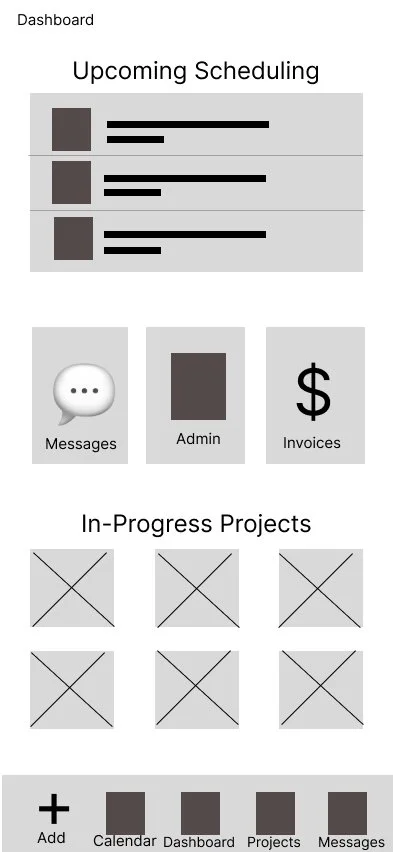
Dashboard Page for Version 1:
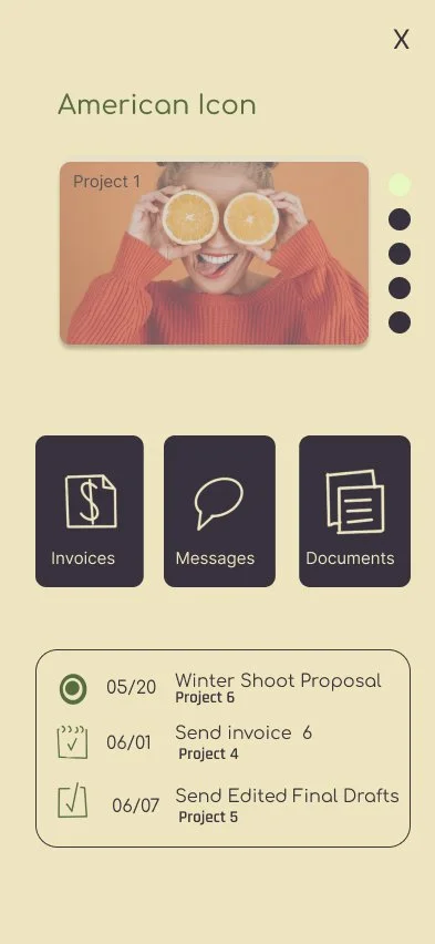
At the top, the dashboard has an upcoming scheduling table followed by a sub-navigation to the Messages, Admin, and Invoices pages. At the bottom are links to In-Progress Projects showing the most recently edited projects. The navigation bar includes the add menu, calendar, dashboard, projects, and messages.
Dashboard Page for Version 2:
At the top, the dashboard has an upcoming scheduling table followed by a sub-navigation to the most recently updated clients. At the bottom are links to In-Progress Projects showing the most recently edited projects. The navigation bar includes the add menu, dashboard, calendar, clients and projects.
Note: For a more comprehensive comparison between versions, view the links to the video walkthrough below.
Did we successfully address the Action Items from Version 1 to Version 2?
The primary user difficulties with version 1 were the task and navigation hierarchy and the invoicing flow. The upcoming scheduling table got many positive comments, so that remained the same. Here is a summary of what changed.
Insights
5 out of 5 participants found the Navigation bar and dashboard tasks to be confusing or somewhat confusing.
4 out of 5 users navigated to the projects page to add a project.
3 out of 5 participants expressed they thought the add menu could be helpful as a quick add for many app tasks.
3 0f 5 participants felt the invoicing process required more confirmation and verification feedback from the app.
Actions Taken
The Sub-Navigation on the Dashboard changed to Quick Access for the most recently updated clients.
The main app tasks can be found through the add menu on the navigation bar and the main related pages: Invoices, Calendar, Clients, and Projects.
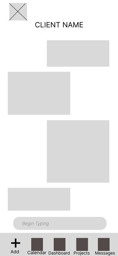
The navigation was updated to have the main pages on the same hierarchal level. Messages are moved to the clients page, and the invoicing action is in the add menu and accessed through the project page.
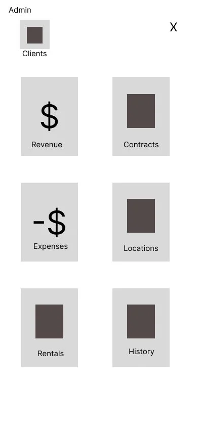
Admin was moved to the top right of the dashboard page, in alignment with many common app designs.
Version 2
User Flow
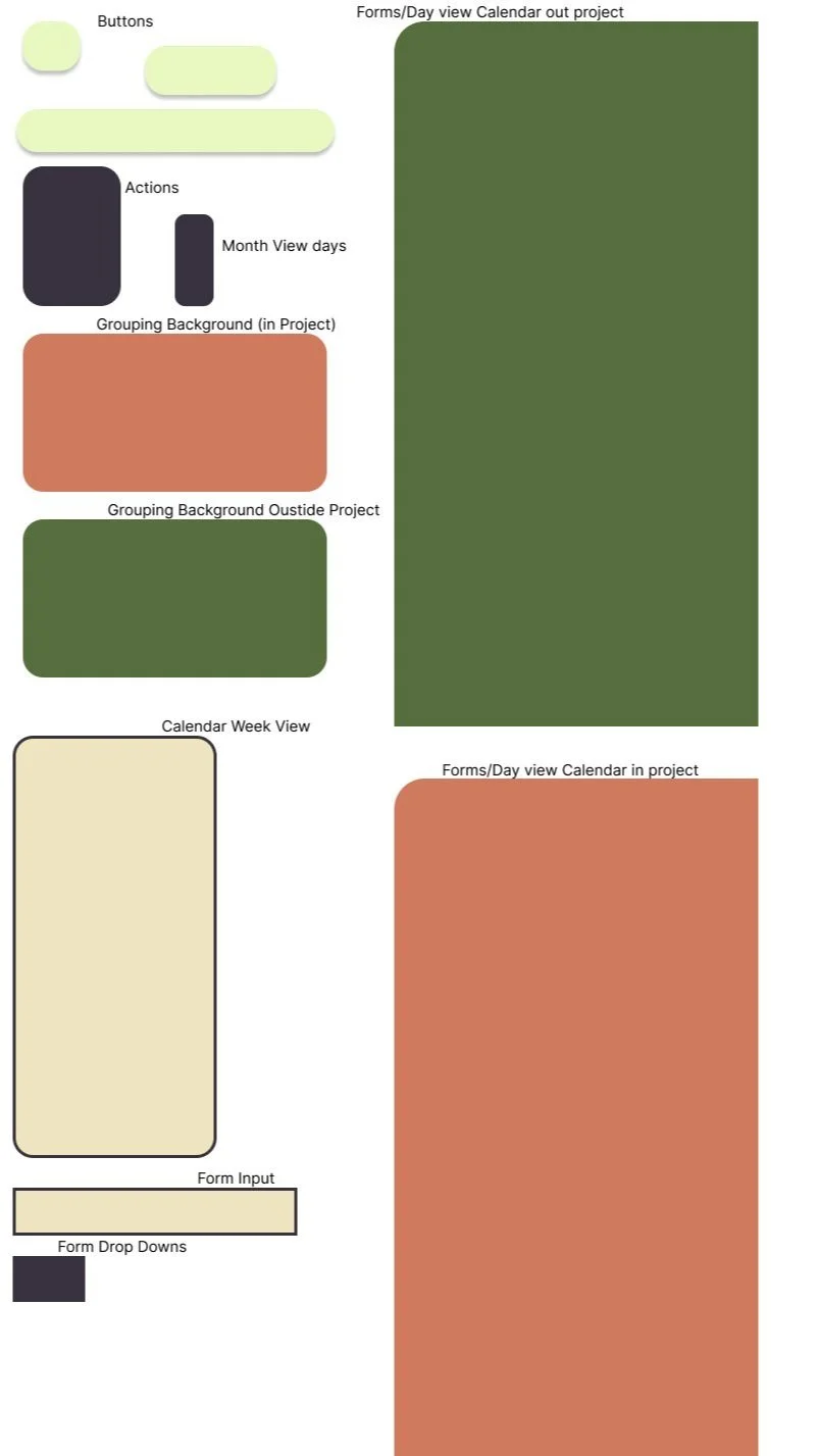
For version 2, I started from the paper wireframe and based changes on the insights from the first usability study. Next, more refined digital wireframes were created and tested informally. Finally, the wireframes were updated with mockups, and Halftone’s branded look was formed. Usability study two was performed on this version of the high-fidelity prototype.
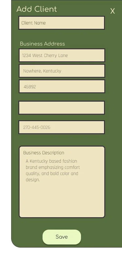
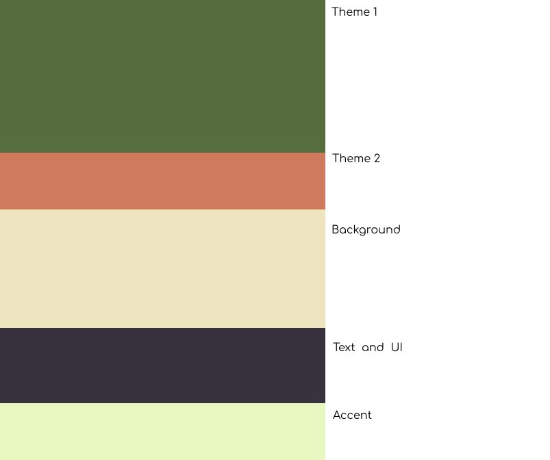
The add button holds all the main tasks of the application: Add Client, Add Project, Add Calendar Item, Add Invoice, and Add Product.
The app's main pages are found in the navigation bar or under admin. They have a white background and an add button with access to the directly related add action.
Additionally, this version fleshed out the workflow features of the app for more functionality.
Design
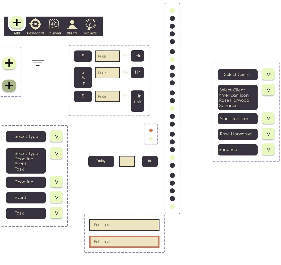


Some Questions Participants were Asked.
“What did you like about the process? What did you not like?”
“How do you feel about this app feature? Would it be helpful?”
“Did you need clarification on anything?”
“ How would you use this feature in your digital creative process?”
Research Data Summary
Task 1
Create a new Project for the Client Kite Community Art
5 out of 5 participants found this process easy.
Two participants did this by navigating from the client on the home page, two by using the add button in the navigation bar, and one went to the projects page and added from there.
Task 4
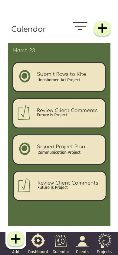
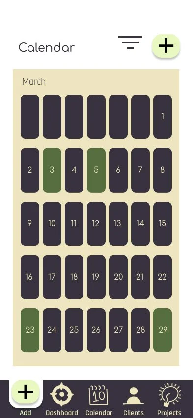
Today is Sunday, the 23rd of March, and you want to look at your to-do list for the day and the week. How would you do that?
5 out of 5 participants found the calendar flow to be easy to navigate.
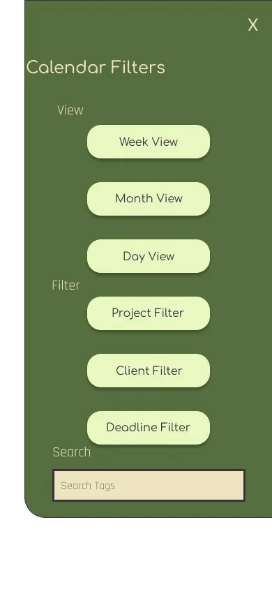
2 out of 5 participants felt they needed more context to find the filter views (the three lines) like the label “calendar filters, filter.”
One participant thought having more of a distinction between high-priority and low-priority tasks would be helpful.
Task 2
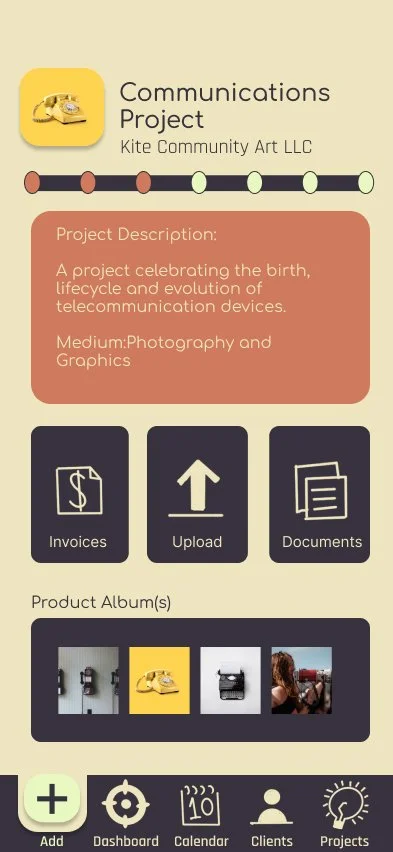
Where would you go to view the timeline for the Communications Project?
4 out of 5 participants had difficulty finding the timeline on the first try. All participants expressed that if there were a word, arrow, or other button indicator for the timeline, it would be easier to find.
3 out of 5 participants first went to the calendar and the dashboard for the project timeline.
One participant felt that this app could be improved with features dedicated to teamwork, like views for different team members and task assortment capabilities for the team leaders.
Task 5
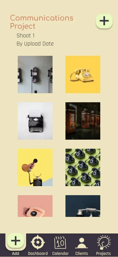
You just remembered that for another client, American Icon, you need to upload your raw photoshoot photos for the Client to view; how would you do that? It would be for Project 1.
4 out of 5 participants found this easy and intuitive to complete.
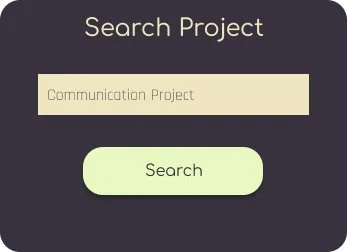
One participant felt it would be helpful for ease of use to search by client and project for tasks that come up quickly.
Task 3
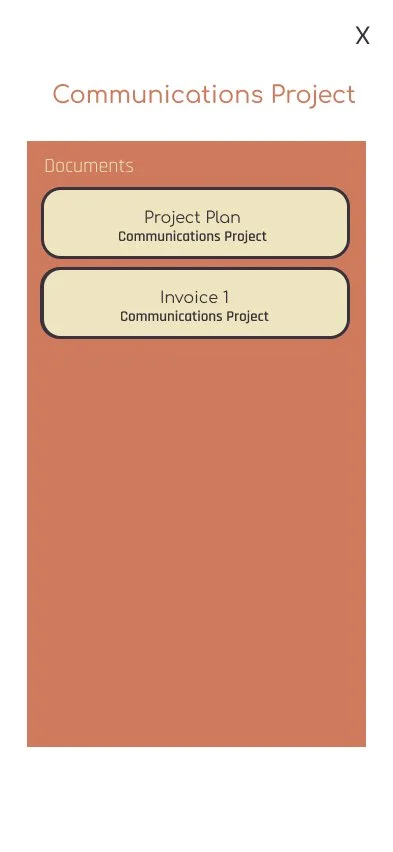
You want to make a note about a shoot location change initiated by the client. How would you do that?
Only 2 out of 5 participants would initially go to the timeline log to make this note.
3 out of 5 participants would like to be able to make this note on the project, documents, or calendar event page.
5 out of 5 participants felt the timeline log should be able to be accessed from other pages, like the projects page or calendar.
Task 6
You want to send an invoice to Kite Community Art for the Communications project. How would you go about doing that?
5 out of 5 participants found this process to be straightforward and easy.
One participant also suggested a search-by-client feature would be helpful.
One participant felt it would be helpful to have a “send to me” feature or a “save to device” feature every time an invoice is sent.
Users Comments
Using the System Usability Scale
For this study, I used the System Usability Scale(SUS) to evaluate the user-perceived usability of the HalfTone Prototype. I had 5 participants. Using the evaluation technique from John Brooke in his 1995 article (pg 6), I got an average SUS score of 89.4. This score is considered to be an “A” in terms of the SUS scale, according to research completed by Jeff Sauro in his 2011 article. Overall, version two addressed many of the usability issues found in the first version.
Actions and Insights
Need to Have Action Items
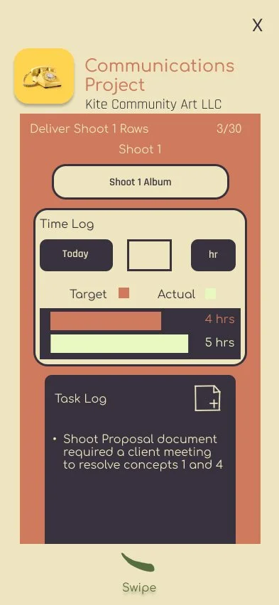
Restructure access to the project timeline
Add access through Calendar
Add access through Dashboard
Restructure access to the project log to be edited through calendar items
Consistent iconography labeling to meet user expectations
Nice to Have Action Items
A distinction between high-priority and low-priority tasks on the calendar and timeline
Add search-by-client and search-by-project features.
More dedicated features for teamwork and collaboration
Version 3
User Flow
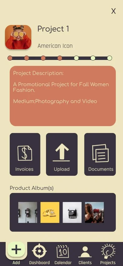
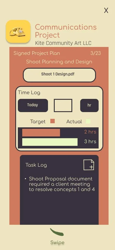
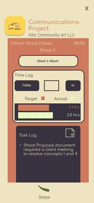
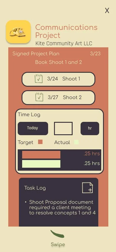
The version 3 update is focused on incorporating the Project timeline into logical and intuitive areas of the app process. Many users searched the dashboard, calendar, and project page when looking for the project timeline and log.
To meet these expectations, the user flow was updated to access the project timeline and project page from the dashboard. The calendar has additional filters that are more helpful, allowing the user to search by project so that the user can search and view calendar items from specific projects and clients.
For a closer look, the user can access both the project page and the project timeline pages on the calendar item pages by pressing the calendar item title. Users can also add comments directly to the log(also located in the project timeline) from the calendar item notes section.
In addition to the navigation updates, the secondary usability study demonstrated that users often found the “X” to exit certain pages was too small to be used effectively. Version 3 tackles this with larger “X” buttons.
Design
Design Walkthroughs and Comparative Analysis
A discussion on design decisions, usability testing results, and design pivots and modifications.
Takeaways
After the prompt, I started with 5 main goals for the app design and process flow. These goals were based on feedback from target users through a preliminary survey. From the data from the first 2 UX tests, User feedback let me know this design met the initial goals.
-
During the second study, Halftone met the user’s expectations for process flow for the app's main functions, including the add menu, calendar, dashboard, and invoicing. User comments mentioned how familiar the design feels to other mainstream applications like Apple Calendar or Messages. After addressing the confusion about access to the project timeline, I anticipate little to no learning curve for the use of the app.
-
The invoicing function of the app is designed to make invoicing easy. The user, throughout every step of their workflow, is updating the project tasks, logging time spent, and updating with any changes, and the invoice at the end of the process is automated with these details so the user is not working from scratch. Users expressed that the detailed view and the ability to set standard rates is an excellent feature. Over all version 2 of the invoicing system was rated highly by users.
-
One notable comment from usability test 2 mentioned how many features could be used for a team, but the initial app was not designed with teamwork in mind. Adding customizable app views and tools access could further improve the overall workflow of this app for every digital creative. Additionally, adding task owners for sections of the timeline tasks would further improve teamwork capabilities.
-
After some of the feedback from the second Usability test, though there is plenty of positive feedback on the flexibility of the design, more design features could be helpful for teamwork capabilities.
-
5 out of 5 of participants from the second Usability test expressed that they thought the majority of app features were efficient.
4 out of 5 stated that they could see themselves using this app for their creative workflow management.

Future Direction
Version 3 addressed many of the usability pain points in Usability Study 2. It also restructured the app navigation to make the project timeline tool more intuitively accessible. However, Version 4 will need to consider features for teamwork collaboration, including team member-specific views, the assigning of tasks by a team leader to the members of their team, and more.
Another thing I would do differently is think more critically about different information input methods. I know that a text-to-speech feature could be incredibly helpful for users and clients a like.
